


A recent question on StackOverflow.com asked Why use Monospace fonts in your IDE.
One of the answers referenced the use of Comic Sans as a font for coding. I couldn’t quite believe it, so I tried it out - and found that Comic Sans is actually very readable at small font sizes, easy on the eye and very compact. Check this out:
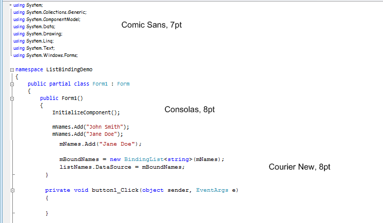
Suprisingly, Comic Sans is at least as readable as Consolas and Courier New at a similar size. For nomal coding, I’ll stick to Consolas 12pt (or Lucida Console 16pt if peer-programming).
But, next time I have a rats-nest of code to unravel, Comic Sans may well come into play.
Comments
blog comments powered by Disqus